At a Glance
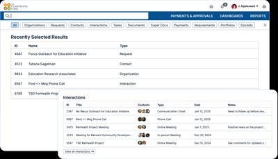
Quick search was supposed to be the fastest way to find records inside GivingData, but it wasn’t living up to that. Users could only search a few record types, important fields weren’t searchable, and results often lacked the context people needed before clicking in. I led the redesign to make search broader, more relevant, and easier to scan.
Challenges
The main gaps:
- You could only search three types of records, even though users needed access to a lot more.
- Critical properties like an organization's Tax ID weren’t searchable at all.
- Search results didn’t always prioritize the most relevant matches.
- Displaying results gave too little context, forcing users to dig deeper just to find what they needed.
All of this slowed people down, created frustration, and made navigating the platform harder than it needed to be.
Role
I led the UX strategy and design for the quick search redesign, from defining problems to prototyping solutions.
I collaborated closely with engineering and product management to make sure we tackled the underlying logic challenges, not just the surface-level UI fixes.
I also worked directly with users to validate ideas, refine search behavior, and test new designs before launch.
Process
We approached the redesign like rebuilding a foundation, not just patching cracks.
- Research: I gathered user feedback and conducted task analyses to understand where search workflows were breaking down. Then, I facilitated a team workshop to better define the problems to solve and the project scope.
- Define Search Scope: We expanded quick search to cover all major record types, not just a limited few.
- Prioritize Results: I redesigned the search logic to surface the most relevant results first, based on match quality and user intent.
- Improve Result Displays: I added richer metadata (like Tax IDs, grant statuses, and contacts' titles) to results so users could recognize what they needed at a glance.
- Prototype + Test: I built interactive prototypes to validate the experience with real users, iterating based on feedback about clarity, speed, and accuracy.

Impact
The redesign made search faster to use and easier to trust:
- Efficiency: Users could find the right record without as many extra clicks or dead ends.
- User satisfaction: Early adopters responded quickly. One community member said, "Our whole team is loving the new quick search! I've had a number of team members tell me how much they like it, that it's easier to use, easier to read, and fast!"
- Room to grow: The updated search could take on new record types and properties without another rebuild.
- Follow-through: After launch, I ran community forum discussions to collect more feedback, which shaped the next round of improvements.