Challenges
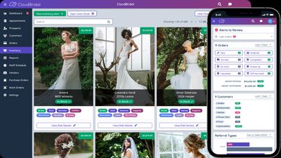
CloudBridal’s brand was easy to overlook, and the interface didn’t feel like one product. Shop owners and brides moved between screens that looked and behaved differently. I focused on three things: a clearer brand, a design system the team could reuse, and UX fixes for the workflows that mattered most.
My Approach
- Competitive research and brand positioning to inform a new logo.
- A design system with reusable UI components and style guidelines.
- A UX audit with prioritized recommendations for the development team.
Solutions
Logo Design
CloudBridal helps bridal shop owners run operations and scheduling. I redesigned the logo to feel more distinctive and approachable, with clean typography and a simplified cloud mark that can stand alone in tight spaces.
The update gave the product a clearer identity and made it easier to recognize across marketing and in-app surfaces.

Design System
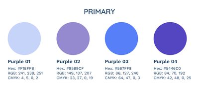
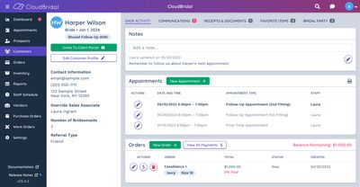
I defined color, typography, and reusable components (buttons, tabs, inputs) so new screens could stay consistent without reinventing styles each time. Key screens showed how to apply the system in real product contexts.
UX Design Consultation
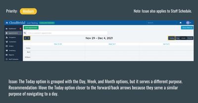
The product had a lot of capability, but some workflows were harder than they needed to be. I audited the experience, prioritized the highest-impact issues, and handed development a concrete plan with rationale for each change.
Example: a redesigned calendar view made it easier for shop owners to manage appointments and complete routine tasks faster.
Impact
- Clearer brand recognition through a more consistent visual identity
- Easier appointment and store-operations flows for shop owners
- Faster UI work for the team through shared components and guidelines